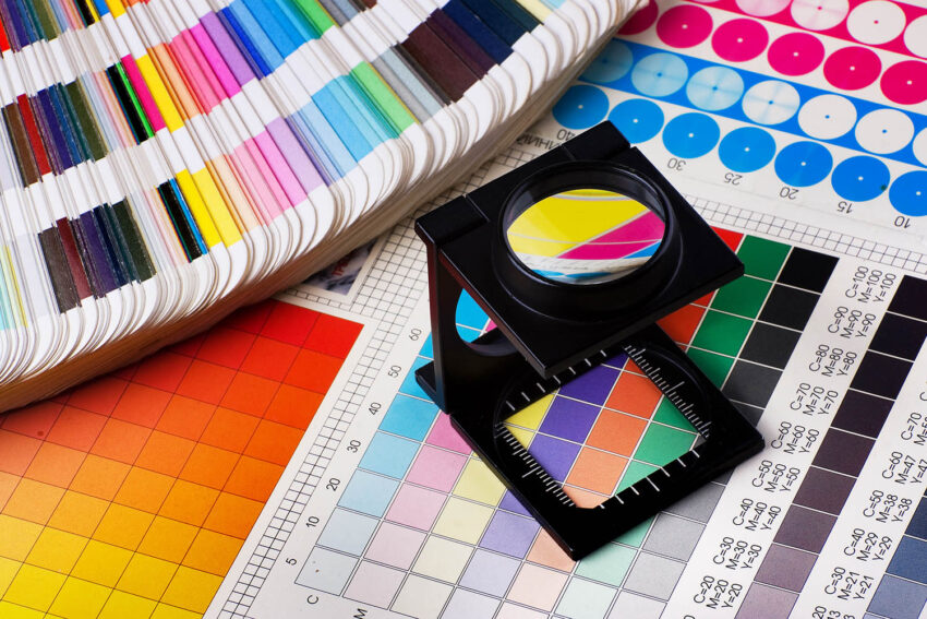
You’ve just picked up your freshly printed business cards, banner, or brochure, and something feels off. The logo that looked crisp and vibrant on your screen now looks slightly duller, or the colours don’t quite match your website. You’re not imagining it, and you’re certainly not alone. This is one of the most common questions I get asked at Evoke Visual, so let’s break down exactly why it happens.
RGB vs CMYK: Two Different Worlds
Screens and printers create colour in completely different ways. Your monitor uses RGB (Red, Green, Blue), which combines light to produce colour. The more light you add, the brighter and more vivid the colour becomes; that’s why screens can display those punchy, glowing blues and neons.
Printers, on the other hand, use CMYK (Cyan, Magenta, Yellow, Black), which works with ink on paper rather than light. Instead of adding light, ink absorbs it, so the colour range, known as the “gamut”, is naturally smaller. Certain bright oranges, deep blues, and neon greens that look stunning on screen simply can’t be reproduced with ink in the same way. When a design built in RGB gets converted to CMYK for print, those vibrant tones shift to the closest achievable equivalent, which is often a touch more muted.
Paper Stock Matters More Than You’d Think
The surface you’re printing on plays a huge role too. Glossy paper reflects light and makes colours appear more saturated, while matte or uncoated stock absorbs more ink and can make the same logo look softer or slightly greyer. Even two “white” papers can have different undertones; some are warmer, some cooler, which subtly affects how your logo’s colours read against the background.
Screen Calibration Adds Another Variable
No two screens display colour identically. Phone screens, laptop displays, and monitors all have different brightness, contrast, and colour calibration settings. So even before a design reaches the printer, what you see on your device may not match what a colleague sees on theirs, let alone what ends up on paper.
Avoiding Surprises
I build brand colours with both mediums in mind from the start. That means:
- Defining your logo’s official colours in RGB, CMYK, and Pantone (spot colour) values if required, so there’s a documented, consistent reference no matter where it’s used
- Choosing colours that translate well across both light-based and ink-based systems, avoiding shades that fall outside the CMYK gamut wherever possible
- Recommending print proofs before a full run, so you see exactly how the ink will look on your chosen stock
- Advising on paper finish based on the effect you want, sharp and vibrant, or soft and premium
A slight shift between screen and print isn’t a mistake; it’s physics. The goal isn’t to make print match your screen exactly (that’s not fully possible), but to make sure your logo still looks intentional, on-brand, and professional wherever it appears.
If you’ve noticed inconsistencies in your own branding across digital and print materials, I’m happy to take a look and set up a proper colour system for you. Get in touch!